research report layout template

In the vast landscape of academic and professional research, clarity and organization play pivotal roles in effectively communicating complex ideas and findings. A research report is not merely a collection of data; it is a narrative that guides the reader through a structured exploration of a topic, illuminating insights and fostering understanding. To facilitate this journey, a research report layout template emerges as an invaluable tool, helping researchers craft their reports with precision and coherence. In this article, we delve into the essential components of an effective research report layout template, highlighting how it can streamline the writing process, enhance readability, and ultimately elevate the impact of one’s work. Whether you are a seasoned researcher or venturing into your first project, understanding the intricacies of layout design will empower you to present your findings with confidence and clarity. Join us as we navigate the intricacies of template creation, offering practical tips and insights tailored to your reporting needs.
Understanding the Essential Components of a Research Report Layout
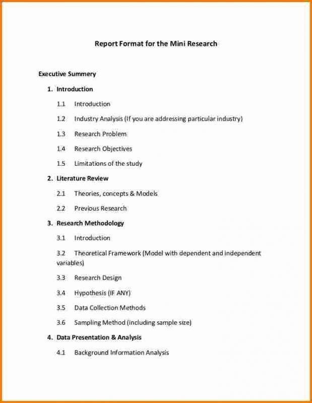
When crafting a research report, it’s crucial to ensure that the layout not only adheres to academic standards but also enhances readability and comprehension. A well-structured report typically includes several key elements: Title Page, Abstract, Introduction, Methodology, Results, Discussion, and Conclusion. Each section serves a distinct purpose and contributes to the overall narrative of the research findings. For example, the abstract provides a succinct summary of the entire report, while the methodology describes how the research was conducted, allowing readers to understand the processes behind the results obtained. Additionally, integrating subheadings within these sections can facilitate smoother navigation through the text.
Beyond textual components, visual aids such as tables and figures play a vital role in enriching a research report. These elements can help to present complex data clearly and concisely. For instance, the use of a table may effectively condense numerical findings, making them more digestible. Below is a simple table example that illustrates how to organize data relevant to your findings:
| Component | Description |
|---|---|
| Title | Main title of the report, succinct and descriptive |
| Abstract | Brief summary of research objectives, methods, and findings |
| Introduction | Background information and research questions posed |
| Conclusion | Summarizes results and their implications |
Each of these components contributes to a cohesive and persuasive report, guiding readers through the research journey in a logical manner. Practically applying this understanding of layout not only showcases the depth and rigor of your work but also invites engagement and comprehension from your audience.

Crafting a Cohesive Structure for Clarity and Impact
Creating a well-structured research report not only enhances readability but also strengthens the impact of your findings. A clear and cohesive layout allows your audience to navigate through your work with ease. Consider the following essential components to ensure clarity and effectiveness:
- Title Page: Clearly display the title, your name, and any affiliations.
- Abstract: Summarize your report in a concise paragraph.
- Table of Contents: Provide easy navigation to each section.
- Introduction: Set the context and present your research question.
- Methodology: Explain the methods used for your research.
- Results: Present your findings with clarity, using visuals when necessary.
- Discussion: Analyze and interpret the results.
- Conclusion: Summarize the key points and implications of your research.
- References: List all sources cited in your report.
Once you have established the key sections, pay close attention to the visual layout. Utilize clear headings and subheadings to guide the reader, and consider incorporating tables for data representation. For instance:
| Section | Description |
|---|---|
| Title Page | Includes report title, author, and date. |
| Abstract | A brief summary of the research. |
| Conclusion | Final thoughts and future research directions. |
This thoughtful arrangement not only conveys professionalism but also improves engagement, ensuring your message resonates effectively with the audience. Consistency in font style and sizing, along with a balanced mix of text and visuals, will further bolster your report’s impact.

Designing Visual Elements to Enhance Data Presentation
html
Incorporating visual elements into a research report not only captivates the audience but also facilitates comprehension of complex data. Graphs, charts, and infographics serve as visual aids that can transform dull numbers into engaging narratives. When designing these elements, consider the following aspects to optimize their impact:
- Color Palette: Use a harmonious color scheme that enhances readability and visual appeal.
- Font Choice: Select clear, legible fonts for labels and headings to improve accessibility.
- Balance: Maintain a balance between text and visuals to avoid overwhelming the viewer.
Furthermore, it’s essential to choose the right type of visual representation for the data you wish to convey. For instance, tables can effectively summarize quantitative data, while pie charts illustrate proportional relationships beautifully. Below is a simple table example to showcase how concise data presentation can look:
Category
Value
Research A
45%
Research B
30%
Research C
25%

Tips for Tailoring Your Template to Different Research Disciplines
When adapting your template for various research disciplines, it’s crucial to consider the specific conventions and expectations that govern each field. For example, in the natural sciences, clarity and precision are paramount, so a straightforward structure with clear headings like “Methods,” “Results,” and ”Discussion” is essential. In contrast, the social sciences may permit a more narrative style, allowing for richer descriptions and theoretical frameworks. Therefore, ensure the formatting reflects the emphasis on data and analysis prevalent in the respective discipline.
Additionally, the inclusion of visual aids can greatly enhance the impact of your report. Utilize tables and graphs to present data succinctly, tailoring their design to be aesthetically pleasing yet functional. Here’s a simple example of how your table could be styled:
| Discipline | Key Features | Visual Aid Examples |
|---|---|---|
| Natural Sciences | Structured, methodical approach. | Charts, Histograms |
| Social Sciences | Narrative style, theoretical frameworks. | Infographics, Surveys |
| Humanities | Critical analysis, interdisciplinary. | Diagrams, Concept Maps |
To Wrap It Up
utilizing a well-structured research report layout template can significantly enhance the clarity and effectiveness of your findings. By following a consistent format, you not only streamline the writing process but also ensure that your audience can easily navigate and comprehend the key elements of your research. Whether you’re crafting a detailed academic paper or a concise business report, the right template serves as a valuable tool, guiding you through each section from the abstract to the conclusion. Embrace the power of templates to elevate your reporting, allowing your insights to shine and resonate with your readers. So, take the next step towards impeccable documentation—choose a layout that best suits your needs and start crafting your impactful research report today!


