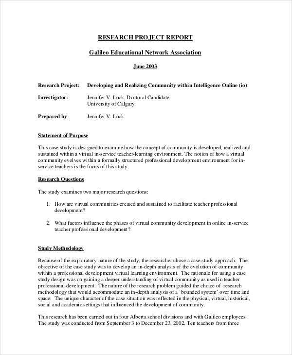
research report format ppt

In today’s academic and professional landscape, the ability to effectively communicate research findings is paramount. As data-driven decision-making becomes increasingly vital, the presentation of research reports has evolved beyond mere text documents to more engaging and visually appealing formats. Among these, PowerPoint presentations (PPT) stand out as a preferred method for conveying complex information succinctly and clearly. An effective research report format for PPT not only ensures that content is organized and coherent but also enhances audience engagement through visuals and structured storytelling. This article delves into the essential elements of a research report format for PowerPoint, exploring best practices, common pitfalls, and tips to elevate your presentations from basic slides to impactful communication tools. Whether you’re preparing for an academic defense, a corporate meeting, or a conference presentation, mastering the art of PPT formatting can transform how your research is received and understood.
Understanding the Essential Components of a Research Report Format
When crafting a research report, understanding its fundamental components is crucial for clarity and coherence. Each element plays a significant role in conveying information effectively. The primary sections typically include:
- Title Page: This should contain the title of the research, along with your name, institution, and date.
- Abstract: A brief summary highlighting the key findings and purpose of the research.
- Introduction: This section outlines the research problem and objectives, providing context for the study.
- Methodology: A detailed description of how the research was conducted, including design and techniques used.
- Results: Presentation of data and findings, often accompanied by tables and figures.
- Discussion: Interpretation of results, linking back to the research questions and literature.
- References: A comprehensive list of all sources cited in your research.
Moreover, formatting plays an essential role in enhancing readability and presentation. Each section should adhere to specific style guidelines, such as APA, MLA, or Chicago, which dictate formatting for headings, font choices, and citation styles. For instance, if using APA style, ensure that:
| Element | APA Requirement |
|---|---|
| Font | 12 pt, Times New Roman |
| Margins | 1 inch on all sides |
| Line Spacing | Double-spaced throughout |
| Page Numbers | Top right corner of each page |
By adhering to these guidelines, researchers can create a well-structured report that effectively communicates their work to the intended audience.

Crafting an Engaging Introduction for Your Presentation
Starting strong is critical for any presentation, especially when it comes to conveying the intricacies of a research report. To captivate your audience from the outset, consider drawing them in with a compelling statistic or a thought-provoking question related to your subject matter. For example, you might want to say, “Did you know that over 70% of research studies go unnoticed due to poor presentation?” This type of opening not only piques curiosity but also establishes the importance of your report, setting the stage for what’s to follow.
Another effective technique is to share a brief anecdote or personal story that ties into the theme of your research. This humanizes the data and allows your audience to connect on a more emotional level. Structure your introduction around key points that will form the backbone of your report, such as:
- The problem being addressed
- Significance of the research
- Objectives and scope
Incorporating these elements not only provides clarity but emboldens your narrative, drawing your audience deeper into the conversation.

Visualizing Data Effectively: Tips for Illustrating Research Findings
html
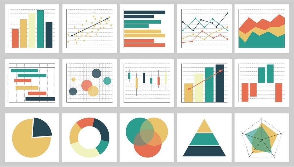
Effective data visualization transforms complex information into understandable visuals, making it easier for your audience to grasp your research findings. To create compelling graphics, consider using clear and concise charts tailored to your data type. For quantitative findings, bar charts and line graphs often work best, while qualitative insights might benefit from pie charts or infographics. Always choose color schemes that enhance readability; for instance, contrasting colors can effectively highlight differences, while a limited palette can maintain a clean look.

Incorporating consistent labeling and annotations is crucial for clarity. Make sure each axis is labeled appropriately, and provide context through titles and subtitles. You can enhance your visuals by including a brief summary or interpretation beside the graphic, guiding your audience through the data narrative. Additionally, always be mindful of your audience's familiarity with the data; avoid technical jargon that might confuse them. Below is a simple table to illustrate how various chart types serve different research purposes:


            Chart Type
            Best For
            Example Use Case


            Bar Chart
            Comparing categories
            Sales by region


            Line Graph
            Showing trends over time
            Yearly revenue growth


            Pie Chart
            Proportions of a whole
            Market share distribution


            Infographic
            Combining visuals and data
            Research summary

Maintaining Clarity and Focus in Your Conclusion Slide
Crafting a strong conclusion slide is essential for reinforcing the key messages of your research report. This final slide should distill the essence of your findings while also providing clear takeaways for your audience. To achieve clarity, focus on summarizing your main points in a concise manner, using bullet points for quick readability. Avoid introducing new data or concepts in this section; instead, emphasize the significance of your research and its implications. Here are some tips for a polished conclusion:
- Highlight key findings succinctly
- Emphasize the practical implications of your work
- Propose areas for future research if applicable
- Maintain a consistent visual design with the rest of your presentation
Furthermore, consider utilizing a simple table to encapsulate the main conclusions in a visually effective way. This allows for a quick reference that enhances understanding and retention. Keep the table minimalist, ensuring that it complements the spoken aspect of your presentation. Here’s an example format:
| Key Findings | Implications |
|---|---|
| Finding 1 | Implication of Finding 1 |
| Finding 2 | Implication of Finding 2 |
| Finding 3 | Implication of Finding 3 |
Closing Remarks
In closing, mastering the format of a research report in PowerPoint enhances not only the clarity of your presentation but also the impact of your findings. By adhering to the essential components—such as a concise introduction, well-organized methodology, clear results, and a thoughtful conclusion—you ensure your audience remains engaged and informed. Remember, the art of conveying complex information lies in your ability to simplify and visually represent your data effectively. As you embark on your next project, consider the principles we’ve discussed and let your research report illuminate your insights with precision and professionalism. Happy presenting!


